A follow-up blog post to our presentation ‘Free Buses For Y’all, Youse, and You Guys’ at the NYC School of Data Conference. This project was done under the guidance and support of the Boston University Data Science Association Club.Introduction: The Case for Fare-Free BusesMy freshman year of college, I went to an event at Boston University’s Initiative on Cities to see some MBTA employees speak on how they were redesigning Boston’s bus system. I was probably the only undergrad who wasn’t being paid to be there. It was honestly not that memorable however what I did learn was how angry people can get at a transit agency for making changes.Most of the crowd were urbanists, but one woman emphatically introduced herself as a “resident,” the incarnation of the hypothetical “residents” that all the politicians were talking about. She proceeded to blow up about how the changes that Boston was making to the bus system were specifically screwing her over. She had a point.Policy change usually can’t improve things for everyone and I think it’s worthwhile to think about how policy impacts real people as opposed to the hypothetical average person. We can talk about free buses in terms of the revenue forfeited and the overall time saved and the jobs created, but seeing who would actually be impacted was the idea that drove this study.Background: Fare-Free buses in other cities + Charles KomanoffCharles Komanoff’s 2025 paper found that simply opening both doors of MTA buses (thus improving passenger flow on and off the bus) as a byproduct of them being free would speed up buses by a full 12%. He estimated that the time saved would be worth $670 million per year, and that other benefits of free buses, such as decreased traffic, less car emissions, and cutting the need to spend money on fare enforcement and administration, added up to $160 million more.Overall this offsets the expected $630 million of revenue that the MTA would lose by making buses free. Komanoff, normally not a free bus activist as much as a fast bus activist, also argues that increased crime and miscreants on the buses as a result of making them free would not be a real problem, given that 45% of riders evade the fare under the current system, so those people can already ride the bus for free.The actual pilot program that NYC ran had results opposite to Komanoff’s estimates: fare-free buses were slower, and didn’t even have faster dwell times, let alone 12% overall increases in travel times. That said, the buses being free increased ridership significantly on those routes, mostly among the existing riders who took more trips for errands and leisure as compared to commuting to work and back.Boston’s free bus pilot found similar results: a large increase in ridership, but overall no impact on travel times. Komanoff mentions that his analysis doesn’t account for the effect of increased ridership on dwell times, and the empirical results make that seem like a crucial oversight. What his paper and the Boston and NYC pilot do agree on is a major decrease in assaults on operators since they no longer have to enforce the fare against unruly passengers.Kansas City made their buses free during Covid and have left them that way until now, although they ultimately ran out of money and recently decided to reinstate the fare starting in June 2026. Their 2022 report estimated that the $9 million of fares not collected each year was offset by $14 million of economic value from that money being in the community, with a total gain of $4.1 million in economic output and 24 jobs added as a result.This is a good result, although the amount saved is only $1 per household per month, so the individual effect of the policy is hard to see.Takeaway: The value of free buses can be quantified in several ways: time saving (Komanoff), jobs created + additional economic value (Kansas City), revenue lost (probably MBTA, definitely KC). But all of this is focused on the aggregate level of an entire city; what is missing, especially as we talk about NYC, is the impacts that it has on individuals, which is the main reason this is even proposed and implemented in certain places.Methodology: Building the “Bus Need Index”Connecting bus-level data to NTA-level data:Neighborhood Tabulation Areas (NTAs) is our primary method of recognizing all neighborhoods in New York City. The nyc.gov website has a downloadable csv or shapefile containing the 2020 NTA boundaries which we used to map specific transit metrics to standardized neighborhood units. NTAs are medium-sized statistical geographies used by NYC to report census data. They are commonly used to analyze neighborhood-level trends rather than colloquial neighborhood boundaries. This gives us a consistent spatial baseline and framework for comparing socio-economic data across the city, as these areas are specifically designed to have minimum population thresholds that ensure statistical reliabilityFor the bus-level data, the MTA publishes a large dataset called “General Transit Feed Specification” (GTFS) that contains schedules and associated data for NYCT Subway, NYCT Bus, and MTA Bus in GTFS static format.The bus-level data is split up for each borough and contains various information about the buses in each NTA, most significantly and most relevant for our project is the station / bus stop locations. This file provides the name of the station / bus stop and its corresponding longitude and latitude.We connected our bus-level data to the NTA-level data through a spatial join process. First, NTA polygon boundaries are loaded from shapefiles and bus stops are extracted from GTFS data across all five boroughs, then stop coordinates are converted from WGS84 (lat/lon) to NY State Plane coordinates to match the shapefile’s coordinate system.A spatial index of bounding boxes is built for efficiency, and each stop is tested against NTA polygons using the ray-casting point-in-polygon algorithm to determine which NTA contains it. Finally, the matched stop-to-NTA assignments are written to a CSV, with any unmatched stops flagged for review.Income:To measure how much the $2.90 bus fare burdens residents from each neighborhood, we got NYC income data from US Census Bureau (tract income) and tract to NTA crosswalk data (ACS) to merge on GEOID to get NTA for each tract’s median income. Then aggregate using the merged dataframe to get median income by NTA. low income = higher need → higher score.We didn’t want to use raw income values so we normalized the data using the min-max formula that flips the scale. Lower-income neighborhoods received a higher score, which reflects greater need. 62 NTAs had no census data at all, which was to be expected. Those were non-residential areas like parks, cemeteries and airports.Figure 1. Normalized Income ScoreCar Ownership:For the “car ownership” variable, we needed some way of knowing how many people owned cars in NYC by NTA. At first glance this seemed quite straightforward as we assumed that there must be a publicly available dataset documenting car registration however we could not find one.What we did find however was a study done by Hunter College Urban Policy and Planning titled: Shifting Gears: Transitioning to a Car-Light New York City. In it, researchers at UPP Hunter “[present] a comprehensive set of strategies designed to foster a streamlined, equitable approach to reducing vehicle ownership in New York City.” (UPP Hunter Urban Policy and Planning)In the appendices of the study, Appendix A gives a spreadsheet with the Vehicles Stored per Square Mile in New York City by NTA. This appendix provided us with the data we needed to understand how many cars were registered in each NTA which gave us a good general idea of the degree to which the population of an NTA relies on cars as a primary mode of transportation rather than the buses we hoped to analyze.Some NTAs appeared to have missing data however we soon realized that those NTAs referred to various parks, cemeteries, airports, etc. that, understandably, would not have vehicle ownership data as they are non-residential NTAs.In order to come up with the final “car ownership score” we used this formula:Bus vs Subway Availability:NYC’s subway system is the largest transit system in the world in terms of number of stations, and is one of the most popular transportation modes for NYC residents. To evaluate the neighborhood’s need for free fares on buses, it’s crucial to keep note of the number of subway stations in their neighborhoods too.We mapped each bus stop and subway station to their respective NTA, and calculated the total number of each of these transportation modes to each NTA (same method as mapping bus stops to NTA). To represent each NTA’s bus needs relative to the subway stations in NYC, we use the following formula:This produces a value between 0 to 1 that plugs into our total bus need index. A value of 1.0 represents an NTA that has zero subway stations and is fully dependent on buses. A value of 0.5 represents an equal bus and subway presence, which from our data seems to be the lowest bus dependency that exists. It’s worth noting that we have approximately 11500 bus stops in our dataset, and approximately 450 subway stations.Reliability:The MTA publishes a massive dataset called “Segment Speeds”, which times the average trip between certain stops (known as “timepoints”) on every route throughout the day. Using the stop times dataset from MTA’s GTFS data, which is the daily schedule of each bus route, we compared the scheduled time between timepoint stops during every hour-long block with the actual time measured during that hour by the segment speeds data.Figure 2. Chart depicting the scheduled and observed Average Travel Time by Hour of DayThe observed time between stops matched the pattern of scheduled times, with an average time of 30 seconds late to every stop measured throughout the system. We calculated the average lateness between timepoints throughout each route and took the average of that as the route’s overall reliability in terms of lateness.Our theory is that the more reliable a bus service is, the more useful making it free will be for the community.Ridership:We used a raw MTA dataset for the beginning of 2025 of bus rides and transfers recorded at every hour, for every bus route, broken down by payment method and fare class. We then cleaned the hourly data into daily totals by summing all the hourly ridership and transfer counts within each day into a single row.From there, we calculated the average daily ridership by taking the total amount of ridership and transfer data for each specific bus route and dividing it by the total number of days that route was listed in the dataset. We then mapped the routes by NTAs to see which routes have the biggest impact when it comes to eliminating fares.Combing Everything:This was used to create the bus need index that scores each NTA from 0 to 1 based on five variables: income, car ownership, bus-versus-subway dependency, service reliability, and ridership. Each variable was normalized to the same scale before being combined using an arbitrarily chosen weighted formula of:W_INCOME = 0.25W_CAR = 0.20W_BUS_SUBWAY = 0.20W_RELIABILITY = 0.15W_RIDERSHIP = 0.20A big thing we considered while creating the index was the weights for each variable. We eventually settled on a slider feature on the map that would allow the user to set the weight of each variable and the score would be recalculated for each NTA, with the map reflecting the change. Connecting the reliability and ridership data to neighborhoods required building a route-to-NTA mapping.Key AnalysisWhich neighborhoods will benefit the most from free buses?East Harlem has the highest need score of any neighborhood, and generally every neighborhood north of Central Park would benefit. Chinatown and LES have low current bus ridership but a lot of stops and low income, making free buses a major upgrade.In the Bronx, the neighborhoods of Belmont, Tremont, and West Farms have the highest need, but most of the borough has a higher than average need. Brooklyn’s hotspots are Flatbush and Bensonhurst, which have high bus ridership and a lot of bus stops. Flushing and Corona in Queens have somewhat lower ridership but lower income.Staten Island generally has lower bus needs, since everyone owns a car anyway.Mamdani election results analysis:One fear we had throughout this project was that every other variable we looked at would be solely correlated with income and our areas of need would just be a list of the poorest neighborhoods in the city.But surprisingly, only bus ridership and bus station density as compared to subways were correlated with the income of an NTA.We theorized that if our bus need index truly did encapsulate the benefits an NTA would receive from free buses, they would have voted more for Zohran since it was one of his most publicized policy plans. and indeed there was a decent 0.281 correlation between our index and Mamdani vote percentage. Probably most of this came from the high correlation between car ownership and voting for Mamdani.Surprisingly, we found no correlation between Mamdani’s vote and income, bus ridership, and bus reliability at the NTA level. The strongest correlation that existed was vehicle ownership, and second strongest was bus need index.Figure 3. Collection of Correlation graphs for different variablesOne more notable finding is that bus vs subway score was negatively correlated with Mamdani, meaning that NTAs with a higher concentration of subway stations as opposed to buses voted significantly more for Mamdani than more bus-heavy NTAs. Between this insight and car ownership being so predictive, subway users seem to have been more likely to vote for Mamdani than busgoers or car owners.Figure 4. Correlation between Bus to Subway scores and Reliability scoresWe also note in the figure above that there is a weak positive correlation between bus/subway score and reliability (albeit within the margin of error for a 95% confidence interval). This is mostly tangential to the project at hand but it does seem that the more bus-heavy an NTA is the smoother their buses run.Environmental insightsWe used NTA level air quality data from the NYC Community Air Survey (NYCCAS) to test whether high bus needs neighborhoods also face worse air pollution. There was a slight positive correlation between bus need scores and NO2 concentrations (r = 0.295).As a side note, our work doesn’t argue that fare-free buses will lead directly to better air quality, but represents an equity observation regarding the communities that most need fare-free buses. These communities are already bearing more pollution burden from traffic, which would be reduced if people opt for bus transportation over ride-shares/cars.Figure 5. Graphs of Bus Need Index vs NTA level of Air PollutantsVisualizing the DataTo bring our Bus Need Index to life, we developed an interactive web tool that allows anyone to explore the data for themselves. Our assigned weights for each variable are nothing more than informed decisions that do not yet carry any data driven meaning.Rather than presenting a static conclusion, we wanted to build a platform that acknowledges the complexity of urban transit, one where the ‘right’ answer often depends on what you think is most valuable.The interactive Heatmap: LINKFigure 6. Screenshot of working Interactive HeatmapOur primary visual is a heatmap of NYC, where colors range from light yellow/green (low need) to dark red (high need). By hovering over specific NTAs, users can see the exact score and the raw data behind it.Because we knew that ‘need’ is a subjective term, we included a high-need threshold slider. As you can see in the sidebar of the map above, this allows us to use a percentile-based approach, focusing only on the ‘Top 20%’ of scoring neighborhoods. This ensures that even as weights are shifted and scores become less varied, we are always highlighting the areas that stand out most relative to the rest of the city.Thus, by toggling the Bus Routes checkboxes, we can see which specific lines act as the routes for these high-need areas. Priority routes are those that serve 3 or more high-need NTAs, suggesting they would be the most impactful candidates for a fare-free pilot program. Secondary Routes serve 1-2 high-need areas, providing a more localized but still vital economic boost to the community.Allowing Users to Have Their Own Input:Figure 7. Another screenshot of Interactive HeatmapThe core of our interactive map is the ‘Adjust Weights’ panel. We recognized early on that our own formula was somewhat arbitrary. To account for this, the dashboard lets you re-weight the entire study!If you believe that reliability is the most critical factor for a free bus system’s success, you can crank that slider up to 100% and watch the map reorganize itself. This transparency allows for a more nuanced discussion: rather than arguing over one ‘correct’ map, we can see which neighborhoods (like Manhattanville or East Harlem) consistently appear at the top of the list regardless of how you balance the variables.Example: Figures 8 and 9. Illustrating how different weights result in different need scoresWeights for the first image:Income: 0.25Car Commuters: 0.20Bus vs Subway: 0.20Reliability: 0.15Ridership: 0.20Weights for the second image:Income: 0.10Car Commuters: 0.25Bus vs Subway: 0.20, Reliability: 0.20Ridership: 0.25ConclusionSummary of FindingsThe NTA with the highest need index for far free buses was Manhattanville-West Harlem using our weights. Playing around with the weights, Manhattanville-West Harlem was consistently taking the #1 spot, if not top 5. Most of the top 10 neighborhoods with the highest priority score lie in Upper Manhattan, the Bronx and Southern Queens.Our lower priority scores are mostly associated with bus stops located in parks, airports, and cemeteries. Other than those exceptional cases, our lowest priority neighborhoods generally lie in Eastern Queens, Lower Manhattan, and Staten Island.Validating the NeedData is only as good as the reality it reflects. To validate our model, we compared our index to the 2025 election results for Zohran Mamdani, whose platform centered on fare-free buses. We found a 0.281 correlation between our need scores and Mamdani’s vote percentage.Notably, while raw income and bus reliability showed no correlation with his support, our combined Bus Need Index did. This suggests that our formula successfully captured a specific transit-dependent political identity that demographics alone miss. People aren’t just voting based on their paycheck, but on their daily experiences with commute.A Path Forward for EquityOur findings also highlight a critical intersection between transit and Environmental Justice. With a 0.295 correlation between bus need and NO2 concentrations, it is clear that the neighborhoods most burdened by transit costs are also those breathing the most polluted air. Fare-free transit is more than an economic subsidy; it is a tool for public health.By targeting the “Priority Routes” we identified, those serving three or more high-need NTAs, the MTA can incentivize a shift away from car dependency in the city’s most vulnerable air quality areas.Future RecommendationsTo conclude this study, we propose the following policy framework:Implement Fare-Free Pilots on Priority RoutesThe MTA should launch fare-free service on any bus route that traverses three or more high-need NTAs to ensure that the subsidy isn’t just helping a single neighborhood, but is supporting larger transit systems for residents in areas like Manhattanville-West Harlem and the Bronx.We began this study by thinking about the ‘angry resident’ at a transit meeting, the person who feels that city-wide averages ignore their specific street. We tried to create a granular model that aims to give as many people/neighborhoods as possible a voice. In a city as vast as NYC, transit shouldn’t just be about where the bus goes, it should be about who the city is willing to move for.Discuss Read More
Mapping Transit Equity in NYC
A follow-up blog post to our presentation ‘Free Buses For Y’all, Youse, and You Guys’ at the NYC School of Data Conference. This project was done under the guidance and support of the Boston University Data Science Association Club.Introduction: The Case for Fare-Free BusesMy freshman year of college, I went to an event at Boston University’s Initiative on Cities to see some MBTA employees speak on how they were redesigning Boston’s bus system. I was probably the only undergrad who wasn’t being paid to be there. It was honestly not that memorable however what I did learn was how angry people can get at a transit agency for making changes.Most of the crowd were urbanists, but one woman emphatically introduced herself as a “resident,” the incarnation of the hypothetical “residents” that all the politicians were talking about. She proceeded to blow up about how the changes that Boston was making to the bus system were specifically screwing her over. She had a point.Policy change usually can’t improve things for everyone and I think it’s worthwhile to think about how policy impacts real people as opposed to the hypothetical average person. We can talk about free buses in terms of the revenue forfeited and the overall time saved and the jobs created, but seeing who would actually be impacted was the idea that drove this study.Background: Fare-Free buses in other cities + Charles KomanoffCharles Komanoff’s 2025 paper found that simply opening both doors of MTA buses (thus improving passenger flow on and off the bus) as a byproduct of them being free would speed up buses by a full 12%. He estimated that the time saved would be worth $670 million per year, and that other benefits of free buses, such as decreased traffic, less car emissions, and cutting the need to spend money on fare enforcement and administration, added up to $160 million more.Overall this offsets the expected $630 million of revenue that the MTA would lose by making buses free. Komanoff, normally not a free bus activist as much as a fast bus activist, also argues that increased crime and miscreants on the buses as a result of making them free would not be a real problem, given that 45% of riders evade the fare under the current system, so those people can already ride the bus for free.The actual pilot program that NYC ran had results opposite to Komanoff’s estimates: fare-free buses were slower, and didn’t even have faster dwell times, let alone 12% overall increases in travel times. That said, the buses being free increased ridership significantly on those routes, mostly among the existing riders who took more trips for errands and leisure as compared to commuting to work and back.Boston’s free bus pilot found similar results: a large increase in ridership, but overall no impact on travel times. Komanoff mentions that his analysis doesn’t account for the effect of increased ridership on dwell times, and the empirical results make that seem like a crucial oversight. What his paper and the Boston and NYC pilot do agree on is a major decrease in assaults on operators since they no longer have to enforce the fare against unruly passengers.Kansas City made their buses free during Covid and have left them that way until now, although they ultimately ran out of money and recently decided to reinstate the fare starting in June 2026. Their 2022 report estimated that the $9 million of fares not collected each year was offset by $14 million of economic value from that money being in the community, with a total gain of $4.1 million in economic output and 24 jobs added as a result.This is a good result, although the amount saved is only $1 per household per month, so the individual effect of the policy is hard to see.Takeaway: The value of free buses can be quantified in several ways: time saving (Komanoff), jobs created + additional economic value (Kansas City), revenue lost (probably MBTA, definitely KC). But all of this is focused on the aggregate level of an entire city; what is missing, especially as we talk about NYC, is the impacts that it has on individuals, which is the main reason this is even proposed and implemented in certain places.Methodology: Building the “Bus Need Index”Connecting bus-level data to NTA-level data:Neighborhood Tabulation Areas (NTAs) is our primary method of recognizing all neighborhoods in New York City. The nyc.gov website has a downloadable csv or shapefile containing the 2020 NTA boundaries which we used to map specific transit metrics to standardized neighborhood units. NTAs are medium-sized statistical geographies used by NYC to report census data. They are commonly used to analyze neighborhood-level trends rather than colloquial neighborhood boundaries. This gives us a consistent spatial baseline and framework for comparing socio-economic data across the city, as these areas are specifically designed to have minimum population thresholds that ensure statistical reliabilityFor the bus-level data, the MTA publishes a large dataset called “General Transit Feed Specification” (GTFS) that contains schedules and associated data for NYCT Subway, NYCT Bus, and MTA Bus in GTFS static format.The bus-level data is split up for each borough and contains various information about the buses in each NTA, most significantly and most relevant for our project is the station / bus stop locations. This file provides the name of the station / bus stop and its corresponding longitude and latitude.We connected our bus-level data to the NTA-level data through a spatial join process. First, NTA polygon boundaries are loaded from shapefiles and bus stops are extracted from GTFS data across all five boroughs, then stop coordinates are converted from WGS84 (lat/lon) to NY State Plane coordinates to match the shapefile’s coordinate system.A spatial index of bounding boxes is built for efficiency, and each stop is tested against NTA polygons using the ray-casting point-in-polygon algorithm to determine which NTA contains it. Finally, the matched stop-to-NTA assignments are written to a CSV, with any unmatched stops flagged for review.Income:To measure how much the $2.90 bus fare burdens residents from each neighborhood, we got NYC income data from US Census Bureau (tract income) and tract to NTA crosswalk data (ACS) to merge on GEOID to get NTA for each tract’s median income. Then aggregate using the merged dataframe to get median income by NTA. low income = higher need → higher score.We didn’t want to use raw income values so we normalized the data using the min-max formula that flips the scale. Lower-income neighborhoods received a higher score, which reflects greater need. 62 NTAs had no census data at all, which was to be expected. Those were non-residential areas like parks, cemeteries and airports.Figure 1. Normalized Income ScoreCar Ownership:For the “car ownership” variable, we needed some way of knowing how many people owned cars in NYC by NTA. At first glance this seemed quite straightforward as we assumed that there must be a publicly available dataset documenting car registration however we could not find one.What we did find however was a study done by Hunter College Urban Policy and Planning titled: Shifting Gears: Transitioning to a Car-Light New York City. In it, researchers at UPP Hunter “[present] a comprehensive set of strategies designed to foster a streamlined, equitable approach to reducing vehicle ownership in New York City.” (UPP Hunter Urban Policy and Planning)In the appendices of the study, Appendix A gives a spreadsheet with the Vehicles Stored per Square Mile in New York City by NTA. This appendix provided us with the data we needed to understand how many cars were registered in each NTA which gave us a good general idea of the degree to which the population of an NTA relies on cars as a primary mode of transportation rather than the buses we hoped to analyze.Some NTAs appeared to have missing data however we soon realized that those NTAs referred to various parks, cemeteries, airports, etc. that, understandably, would not have vehicle ownership data as they are non-residential NTAs.In order to come up with the final “car ownership score” we used this formula:Bus vs Subway Availability:NYC’s subway system is the largest transit system in the world in terms of number of stations, and is one of the most popular transportation modes for NYC residents. To evaluate the neighborhood’s need for free fares on buses, it’s crucial to keep note of the number of subway stations in their neighborhoods too.We mapped each bus stop and subway station to their respective NTA, and calculated the total number of each of these transportation modes to each NTA (same method as mapping bus stops to NTA). To represent each NTA’s bus needs relative to the subway stations in NYC, we use the following formula:This produces a value between 0 to 1 that plugs into our total bus need index. A value of 1.0 represents an NTA that has zero subway stations and is fully dependent on buses. A value of 0.5 represents an equal bus and subway presence, which from our data seems to be the lowest bus dependency that exists. It’s worth noting that we have approximately 11500 bus stops in our dataset, and approximately 450 subway stations.Reliability:The MTA publishes a massive dataset called “Segment Speeds”, which times the average trip between certain stops (known as “timepoints”) on every route throughout the day. Using the stop times dataset from MTA’s GTFS data, which is the daily schedule of each bus route, we compared the scheduled time between timepoint stops during every hour-long block with the actual time measured during that hour by the segment speeds data.Figure 2. Chart depicting the scheduled and observed Average Travel Time by Hour of DayThe observed time between stops matched the pattern of scheduled times, with an average time of 30 seconds late to every stop measured throughout the system. We calculated the average lateness between timepoints throughout each route and took the average of that as the route’s overall reliability in terms of lateness.Our theory is that the more reliable a bus service is, the more useful making it free will be for the community.Ridership:We used a raw MTA dataset for the beginning of 2025 of bus rides and transfers recorded at every hour, for every bus route, broken down by payment method and fare class. We then cleaned the hourly data into daily totals by summing all the hourly ridership and transfer counts within each day into a single row.From there, we calculated the average daily ridership by taking the total amount of ridership and transfer data for each specific bus route and dividing it by the total number of days that route was listed in the dataset. We then mapped the routes by NTAs to see which routes have the biggest impact when it comes to eliminating fares.Combing Everything:This was used to create the bus need index that scores each NTA from 0 to 1 based on five variables: income, car ownership, bus-versus-subway dependency, service reliability, and ridership. Each variable was normalized to the same scale before being combined using an arbitrarily chosen weighted formula of:W_INCOME = 0.25W_CAR = 0.20W_BUS_SUBWAY = 0.20W_RELIABILITY = 0.15W_RIDERSHIP = 0.20A big thing we considered while creating the index was the weights for each variable. We eventually settled on a slider feature on the map that would allow the user to set the weight of each variable and the score would be recalculated for each NTA, with the map reflecting the change. Connecting the reliability and ridership data to neighborhoods required building a route-to-NTA mapping.Key AnalysisWhich neighborhoods will benefit the most from free buses?East Harlem has the highest need score of any neighborhood, and generally every neighborhood north of Central Park would benefit. Chinatown and LES have low current bus ridership but a lot of stops and low income, making free buses a major upgrade.In the Bronx, the neighborhoods of Belmont, Tremont, and West Farms have the highest need, but most of the borough has a higher than average need. Brooklyn’s hotspots are Flatbush and Bensonhurst, which have high bus ridership and a lot of bus stops. Flushing and Corona in Queens have somewhat lower ridership but lower income.Staten Island generally has lower bus needs, since everyone owns a car anyway.Mamdani election results analysis:One fear we had throughout this project was that every other variable we looked at would be solely correlated with income and our areas of need would just be a list of the poorest neighborhoods in the city.But surprisingly, only bus ridership and bus station density as compared to subways were correlated with the income of an NTA.We theorized that if our bus need index truly did encapsulate the benefits an NTA would receive from free buses, they would have voted more for Zohran since it was one of his most publicized policy plans. and indeed there was a decent 0.281 correlation between our index and Mamdani vote percentage. Probably most of this came from the high correlation between car ownership and voting for Mamdani.Surprisingly, we found no correlation between Mamdani’s vote and income, bus ridership, and bus reliability at the NTA level. The strongest correlation that existed was vehicle ownership, and second strongest was bus need index.Figure 3. Collection of Correlation graphs for different variablesOne more notable finding is that bus vs subway score was negatively correlated with Mamdani, meaning that NTAs with a higher concentration of subway stations as opposed to buses voted significantly more for Mamdani than more bus-heavy NTAs. Between this insight and car ownership being so predictive, subway users seem to have been more likely to vote for Mamdani than busgoers or car owners.Figure 4. Correlation between Bus to Subway scores and Reliability scoresWe also note in the figure above that there is a weak positive correlation between bus/subway score and reliability (albeit within the margin of error for a 95% confidence interval). This is mostly tangential to the project at hand but it does seem that the more bus-heavy an NTA is the smoother their buses run.Environmental insightsWe used NTA level air quality data from the NYC Community Air Survey (NYCCAS) to test whether high bus needs neighborhoods also face worse air pollution. There was a slight positive correlation between bus need scores and NO2 concentrations (r = 0.295).As a side note, our work doesn’t argue that fare-free buses will lead directly to better air quality, but represents an equity observation regarding the communities that most need fare-free buses. These communities are already bearing more pollution burden from traffic, which would be reduced if people opt for bus transportation over ride-shares/cars.Figure 5. Graphs of Bus Need Index vs NTA level of Air PollutantsVisualizing the DataTo bring our Bus Need Index to life, we developed an interactive web tool that allows anyone to explore the data for themselves. Our assigned weights for each variable are nothing more than informed decisions that do not yet carry any data driven meaning.Rather than presenting a static conclusion, we wanted to build a platform that acknowledges the complexity of urban transit, one where the ‘right’ answer often depends on what you think is most valuable.The interactive Heatmap: LINKFigure 6. Screenshot of working Interactive HeatmapOur primary visual is a heatmap of NYC, where colors range from light yellow/green (low need) to dark red (high need). By hovering over specific NTAs, users can see the exact score and the raw data behind it.Because we knew that ‘need’ is a subjective term, we included a high-need threshold slider. As you can see in the sidebar of the map above, this allows us to use a percentile-based approach, focusing only on the ‘Top 20%’ of scoring neighborhoods. This ensures that even as weights are shifted and scores become less varied, we are always highlighting the areas that stand out most relative to the rest of the city.Thus, by toggling the Bus Routes checkboxes, we can see which specific lines act as the routes for these high-need areas. Priority routes are those that serve 3 or more high-need NTAs, suggesting they would be the most impactful candidates for a fare-free pilot program. Secondary Routes serve 1-2 high-need areas, providing a more localized but still vital economic boost to the community.Allowing Users to Have Their Own Input:Figure 7. Another screenshot of Interactive HeatmapThe core of our interactive map is the ‘Adjust Weights’ panel. We recognized early on that our own formula was somewhat arbitrary. To account for this, the dashboard lets you re-weight the entire study!If you believe that reliability is the most critical factor for a free bus system’s success, you can crank that slider up to 100% and watch the map reorganize itself. This transparency allows for a more nuanced discussion: rather than arguing over one ‘correct’ map, we can see which neighborhoods (like Manhattanville or East Harlem) consistently appear at the top of the list regardless of how you balance the variables.Example: Figures 8 and 9. Illustrating how different weights result in different need scoresWeights for the first image:Income: 0.25Car Commuters: 0.20Bus vs Subway: 0.20Reliability: 0.15Ridership: 0.20Weights for the second image:Income: 0.10Car Commuters: 0.25Bus vs Subway: 0.20, Reliability: 0.20Ridership: 0.25ConclusionSummary of FindingsThe NTA with the highest need index for far free buses was Manhattanville-West Harlem using our weights. Playing around with the weights, Manhattanville-West Harlem was consistently taking the #1 spot, if not top 5. Most of the top 10 neighborhoods with the highest priority score lie in Upper Manhattan, the Bronx and Southern Queens.Our lower priority scores are mostly associated with bus stops located in parks, airports, and cemeteries. Other than those exceptional cases, our lowest priority neighborhoods generally lie in Eastern Queens, Lower Manhattan, and Staten Island.Validating the NeedData is only as good as the reality it reflects. To validate our model, we compared our index to the 2025 election results for Zohran Mamdani, whose platform centered on fare-free buses. We found a 0.281 correlation between our need scores and Mamdani’s vote percentage.Notably, while raw income and bus reliability showed no correlation with his support, our combined Bus Need Index did. This suggests that our formula successfully captured a specific transit-dependent political identity that demographics alone miss. People aren’t just voting based on their paycheck, but on their daily experiences with commute.A Path Forward for EquityOur findings also highlight a critical intersection between transit and Environmental Justice. With a 0.295 correlation between bus need and NO2 concentrations, it is clear that the neighborhoods most burdened by transit costs are also those breathing the most polluted air. Fare-free transit is more than an economic subsidy; it is a tool for public health.By targeting the “Priority Routes” we identified, those serving three or more high-need NTAs, the MTA can incentivize a shift away from car dependency in the city’s most vulnerable air quality areas.Future RecommendationsTo conclude this study, we propose the following policy framework:Implement Fare-Free Pilots on Priority RoutesThe MTA should launch fare-free service on any bus route that traverses three or more high-need NTAs to ensure that the subsidy isn’t just helping a single neighborhood, but is supporting larger transit systems for residents in areas like Manhattanville-West Harlem and the Bronx.We began this study by thinking about the ‘angry resident’ at a transit meeting, the person who feels that city-wide averages ignore their specific street. We tried to create a granular model that aims to give as many people/neighborhoods as possible a voice. In a city as vast as NYC, transit shouldn’t just be about where the bus goes, it should be about who the city is willing to move for.Discuss Read More

Related Posts
Digital intentionality is not about productivity
Published on January 12, 2026 3:09 AM GMTMy friend Justis wrote a post this week…
2026: The year of throwing my agency at my health (now with added cyborgism)
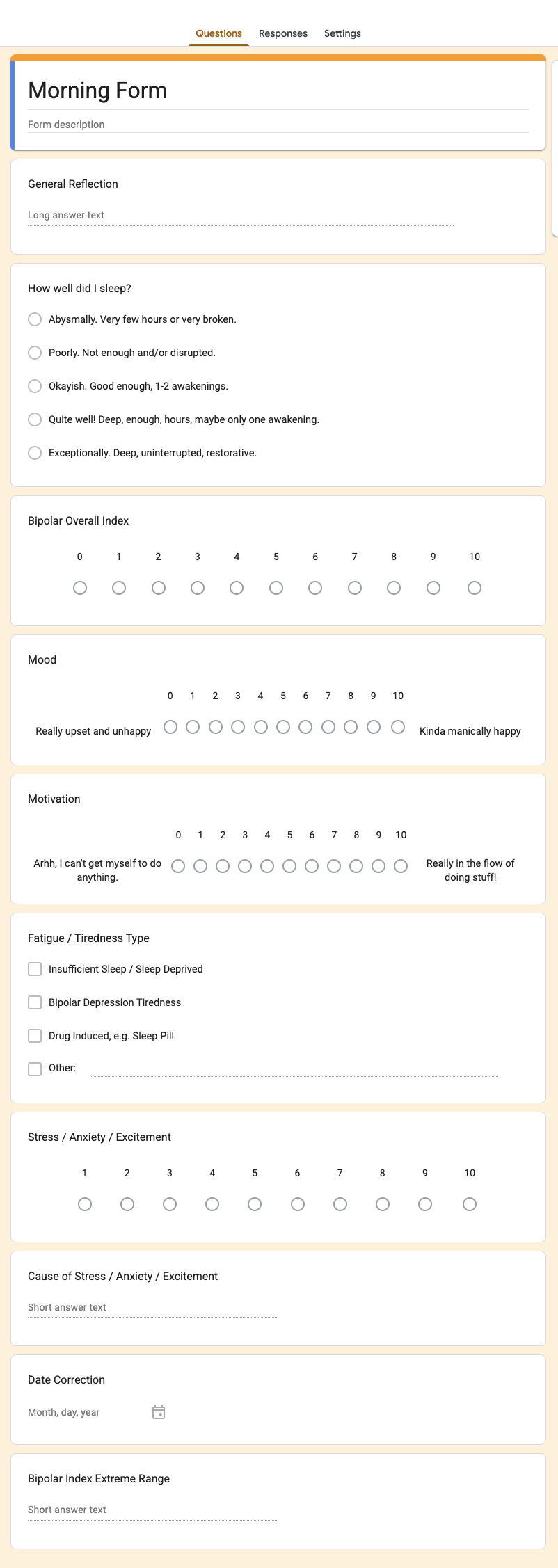
I have bipolar disorder. I was diagnosed in late 2012 following my one and only…
Podcast: Jeremy Howard is bearish on LLMs
Jeremy Howard was recently[1] interviewed on the Machine Learning Street Talk podcast: YouTube link, interactive transcript,…